Name Typography
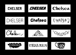
 For this project we were instructed to create 12 name plates that represented an aspect of ourselves based on how the name was presented. In order to do this we used downloaded fonts, manipulated fonts, and hand drawn type. The day it was assigned to the day it was turned in was about a three week period. As our first project it was good to start with a project that strongly pushed our creativity, even if that was a challenge. I loved learning more about typography and how to start with handwritten typography; I had not tried it before, and it was nice to be introduced to something brand new right from the start of the year. Throughout the project I was told to push my limits a little bit more and I think that that truly helped me grasp how to push my creativity to its limits. I continuously altered my handwritten typography as I knew it could be better. I liked this as our first project because it allowed us to become aquatinted with the software again after a long summer. It also was a good way to get to know each other quickly.
Company Rebranding
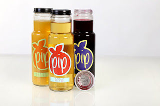
 After the name plates, we were told to find a company and completely rebrand it. For us this meant a new logo and new packaging. We started by sketching many many logo ideas, critiquing them, and altering them until we chose one final logo. Once we chose a logo and developed the colors for it we began to think about package design. We ended the project after two months by photographing our finished product in the studio and displaying them in the hallway of our school. I liked this project a lot as it was a new experience and it was a good feeling to compare the company that you started with to your final product and see the difference that our designs had made. It took me personally a long time to create a logo that I felt good about. In fact, the final logo of my project was never critiqued because I came up with the idea so late in the process. This project introduced us to creating logos and how to alter something that already exists instead of creating something from our mind. I learned a lot about hierarchy through the package designing and how the consumer should be able to see the brand before anything else on a package. My company was a juice company and i created each flavor to have a name that involved a pun. I liked this idea and originally had these names very large on the from of my bottles. I was told that the names being larger than the company's logo was confusing as that the first thought of someone seeing the bottle will think that the name of the flavor is the seller. I listened to this feedback and took into consideration hierarchy when I went to change my packaging.
 Menu Redesign
We are currently redesigning a menu for a restaurant that already has a logo and an established brand. We were told not to touch the logo but completely recreate a menu for them. This is a fun project because we get to work in InDesign which is new to most of us. We are also learning more and more about columns, grids, and character and paragraph styles each day. These allow us to create eye lines that are pleasing to the reader's eyes. Because we cannot alter the logo we are learning how to work around something that may not be our own or may not be a very good design. I like this project because it is very realistic in comparison to something we may get hired to do in the real business world.Extra Projects
I have done a few projects that were not assigned in class as well as the ones above. I have created a poster for a fundraiser here at school and the graphics for a band documentary that our peers in the video strand are making, as well as a few video projects for some friends and my church. I have learned to work alongside peer for clients a lot through these projects and I like to be able to incorporate my photography into projects like I was able to do for the band documentary CD cover.

No comments:
Post a Comment